
In today’s digital-first world, more than 60% of website traffic comes from mobile devices. For small businesses in Atlanta, having a mobile-friendly website is no longer optional—it’s essential for attracting customers, improving search rankings, and generating leads.
A website that isn’t optimized for mobile can frustrate users, increase bounce rates, and reduce conversions. On the other hand, a responsive, mobile-first design keeps visitors engaged and encourages them to take action.
This guide explains why mobile-friendly design matters and how Atlanta businesses can optimize their websites for better results.
What is a Mobile-Friendly Website?
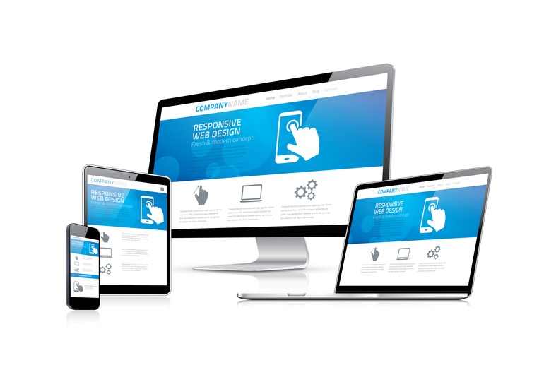
A mobile-friendly website is designed to look, load, and function perfectly on smartphones and tablets. Key features include:
- Responsive layout that adapts to any screen size
- Fast loading times
- Clickable buttons and touch-friendly menus
- Readable fonts without zooming
- Easy-to-use forms and CTAs
For Atlanta small businesses, mobile-friendly design ensures your local customers can interact with your business anytime, anywhere.
1. Mobile Traffic is Dominating
Studies show that most users search and browse on mobile devices, especially when looking for local services.
- Atlanta residents often search for “web design near me” or “small business services Atlanta” on their phones.
- If your website isn’t mobile-friendly, visitors are more likely to leave and contact a competitor instead.
Mobile optimization is critical for capturing leads from local searches.
2. Google Prioritizes Mobile-Friendly Websites
Google uses mobile-first indexing, which means the mobile version of your website determines your search ranking.
Impact on Atlanta businesses:
- Websites that are slow or difficult to use on mobile may rank lower in local search results
- Mobile-friendly design improves visibility in Google Maps and local packs
- Optimized mobile UX signals credibility and relevance to Google
3. Better User Experience (UX)
A mobile-friendly website provides a smooth and intuitive experience, increasing the chances of conversions.
Mobile UX best practices:
- Simplified navigation menus
- Easy-to-read text without zooming
- Clear calls-to-action above the fold
- Click-to-call buttons for immediate contact
- Minimal pop-ups that don’t disrupt browsing
A seamless mobile UX keeps Atlanta users engaged and encourages them to contact your business.
4. Faster Load Times Improve Engagement
Mobile users expect instant access. Slow-loading websites lead to:
- High bounce rates
- Lower conversion rates
- Poor search rankings
Tips to improve mobile speed:
- Optimize images for web
- Minimize heavy scripts and plugins
- Use reliable hosting
- Implement caching
A fast mobile website ensures your Atlanta visitors stay on your page and take action.
5. Click-to-Call Buttons Drive Local Leads
For local businesses, mobile devices are often used to call or visit a business immediately.
Why click-to-call matters:
- Reduces friction for potential customers
- Increases immediate inquiries
- Improves lead conversion
Adding click-to-call buttons for Atlanta-based phone numbers makes your website a direct sales tool.
6. Mobile-Friendly Forms Boost Conversions
Forms that are hard to fill out on mobile reduce leads.
Form optimization tips:
- Use large input fields
- Limit required fields to essential information
- Use a clean layout with clear labels
- Include a CTA button above the keyboard
Mobile-optimized forms make it easy for Atlanta customers to reach your business.
7. Mobile SEO Enhances Local Visibility
Mobile-friendly design also supports SEO, especially for local searches.
Mobile SEO tips:
- Ensure pages load under 3 seconds
- Use responsive design to avoid duplicate content
- Optimize headings and meta tags for mobile
- Include structured data and Google Maps integration
For Atlanta small businesses, mobile SEO helps rank higher in local search results.
8. Competitive Advantage in Atlanta
Many small businesses still have desktop-focused websites. A mobile-first approach gives you an edge:
- Outrank competitors in Google search
- Capture more local leads
- Improve customer satisfaction and trust
A well-optimized mobile website signals professionalism to visitors.
Conclusion: Mobile-Friendly Design is Non-Negotiable
For Atlanta businesses, a mobile-friendly website is no longer optional—it’s a critical business strategy. Mobile optimization improves user experience, boosts local SEO, increases conversions, and helps your business stay competitive in a mobile-driven market.
Ready to Make Your Website Mobile-Friendly?
At Ricka Websites and Logos, we specialize in creating responsive, mobile-first websites for small businesses in Atlanta and Metro Atlanta.
Contact us today for a free consultation and see how a mobile-friendly website can generate more leads and grow your business.
👉 Get Started Today
- Phone: 786-444-9158
- Email: Contact@rickawebsitesandlogos.com